
I went to see a friend this morning who wanted advice on how to applique light coloured pieces on a dark background for a very special quilt she is making (50th wedding anniversary – how about that?!) and it seemed a good idea to include my techniques here too whilst I was on the topic. This is a bit of a re-cap for some of you, but as my previous posts were all lost, which I know many of you used over and over again for info on techniques (you kindly wrote to tell me so), I thought it worth a bit of a re-run.
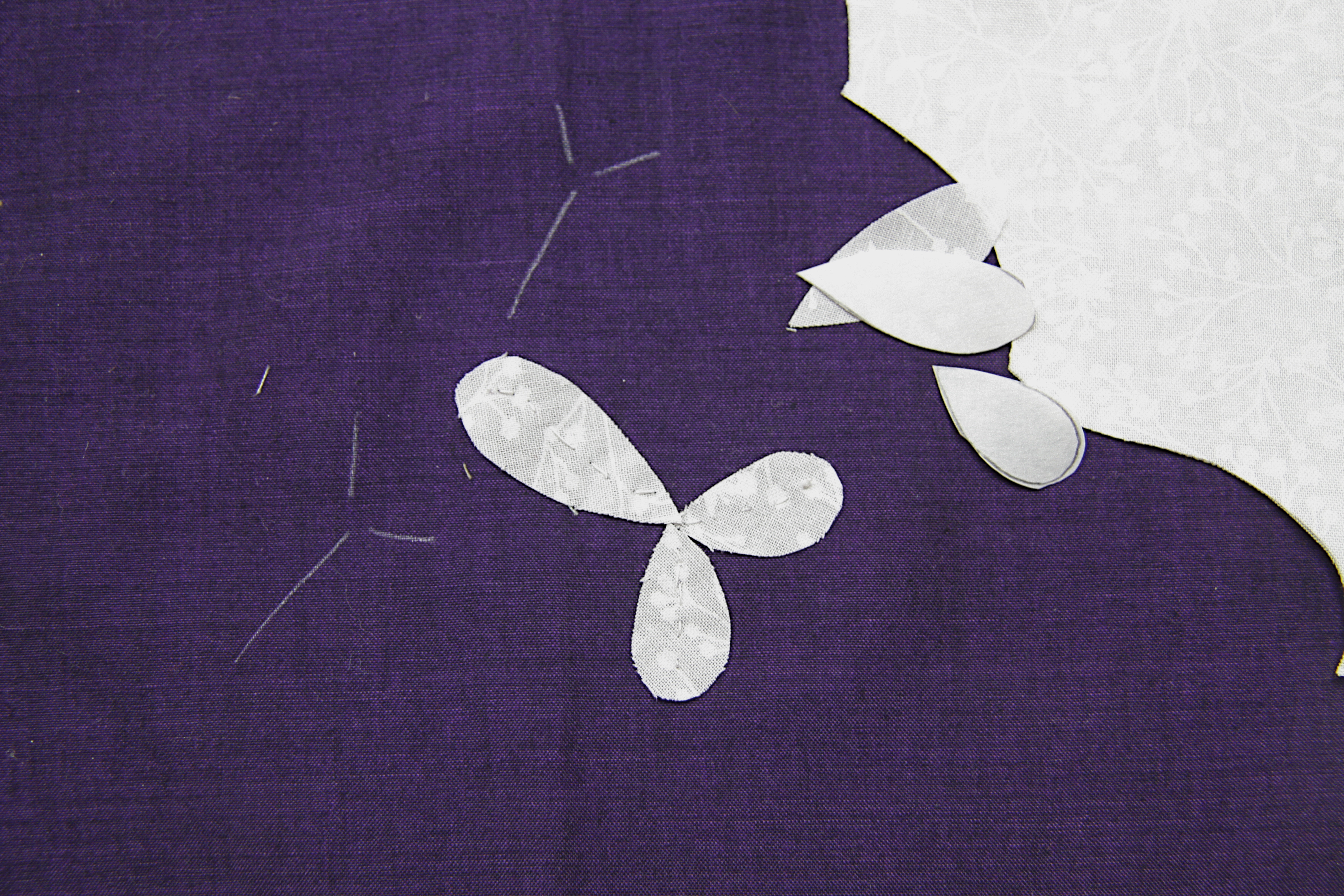
Few things pop more than white flowers on a dark background. I love using rich dark backgrounds and knowing that white is the surest way to add some sparkle to a piece I always try to balance some white flowers throughout the quilt. This is the applique I am working on at the moment. It all looks a bit of a mess at this point but the white daisy and three petalled flower all have fabric stitched beneath them to give a bright white appearance and avoid the dark purple background showing through.

This photo below is from my finished quilt Euphoria to illustrate just how much I love light flowers on a dark background. Don’t the white flowers just pop….

In both cases the white applique pieces have been interfaced to prevent the dark background showing through. To illustrate just how bad it can look I sewed a sample petal this morning without any interfacing so you can see the problem – the turned under allowance is clearly visible as is the dark shadow of background showing through. Trust me, it looks even worse in real life than the photo illustrates….

For those of you that know my work, my applique broadly divides into two techniques – fabric gathered up around a template (circles, ovals) and non round pieces such as petals and leaves which I sew directly on to the background. For petals and leaves here are three ways to interface your applique relatively painlessly. My favoured method is to sew another white fabric underneath. This isn’t as onerous as it sounds and gives perfect results. Use your freezer paper to cut your applique pieces in the usual way, leaving your generous seam allowance. When you have cut all your pieces for applique peel off the freezer paper to use again as a guide to cut your interfacing fabric. Iron it on as usual but this time cut the motif slightly smaller than the paper template (ie you’ll be cutting the paper edge too). Remove the freezer paper and stitch this in place with a small neat basting stitch through the centre of the motif as shown. As you’ll see I have used a printed white on white fabric – one I know I will never use and hence its use here – ( I know the print will not show through and I don’t want to use my lovely Oakshotts for anything unseen!). By using the freezer paper template in this way you will get exactly the right size for the interfacing. Stitch in place.
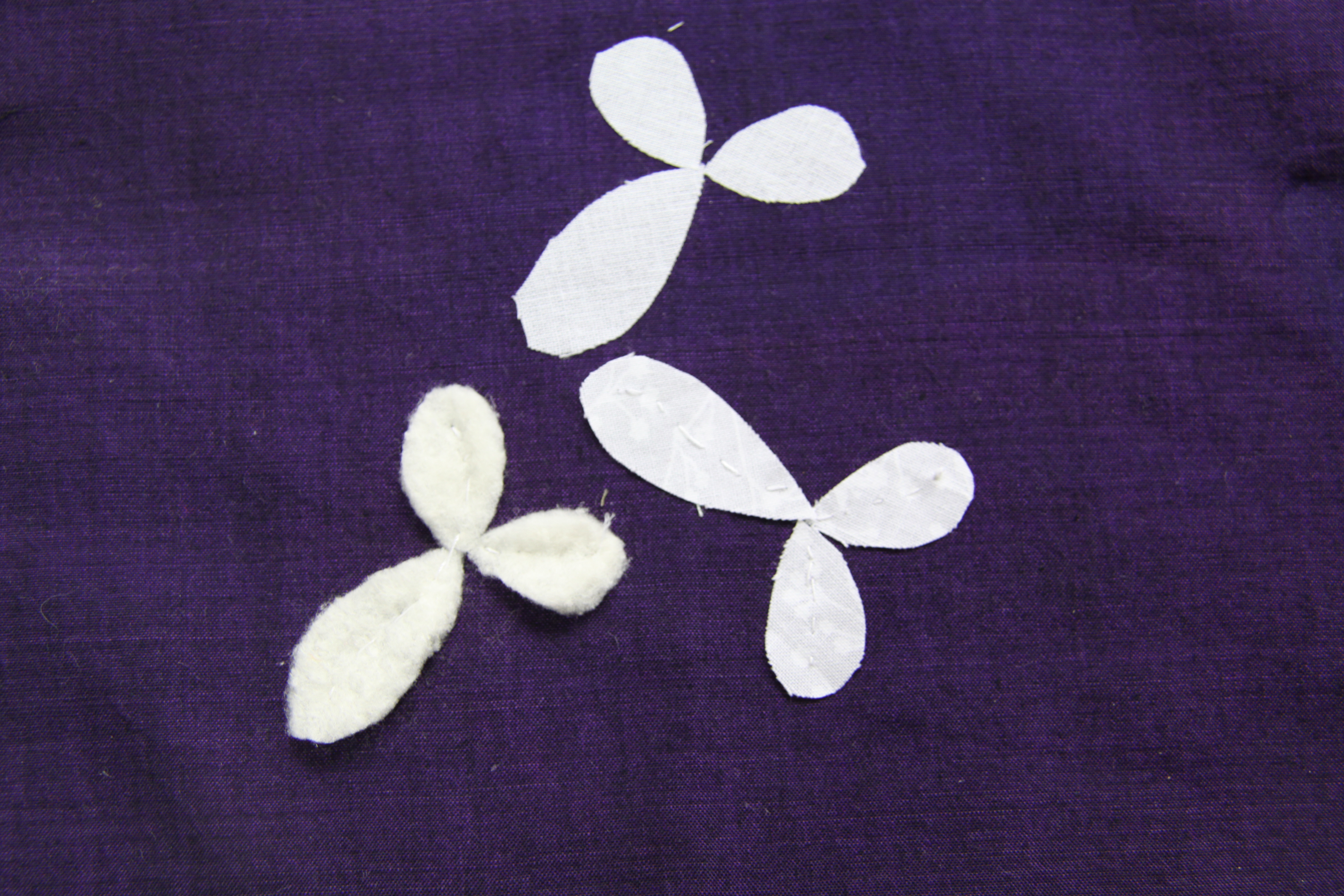
It’s important to only stitch down the centre because when you come to applique your piece on top you will find that you will automatically turn the seam allowance under the edges of this base piece. Your final white flower will look perfect, no seam allowance showing, no “shadowing”. You can spice things up even more by using a batting instead of fabric to interface the piece and this will give you gorgeous raised white motifs as perfectly illustrated by these berries.

I made a mock up of your three best options this morning – white fabric stitched through the centre, batting stitched through the centre and, for those of you who feel life is just too short for this sort of nonsense, a fusible interfacing ironed in place. This latter option will inevitably give a firmer result which may not matter to you and is definitely a better option than nothing at all, so I’ve included it as well. I never use glue in my work but I’m sure this would be a good time for those of you who do use it, to put it into action.
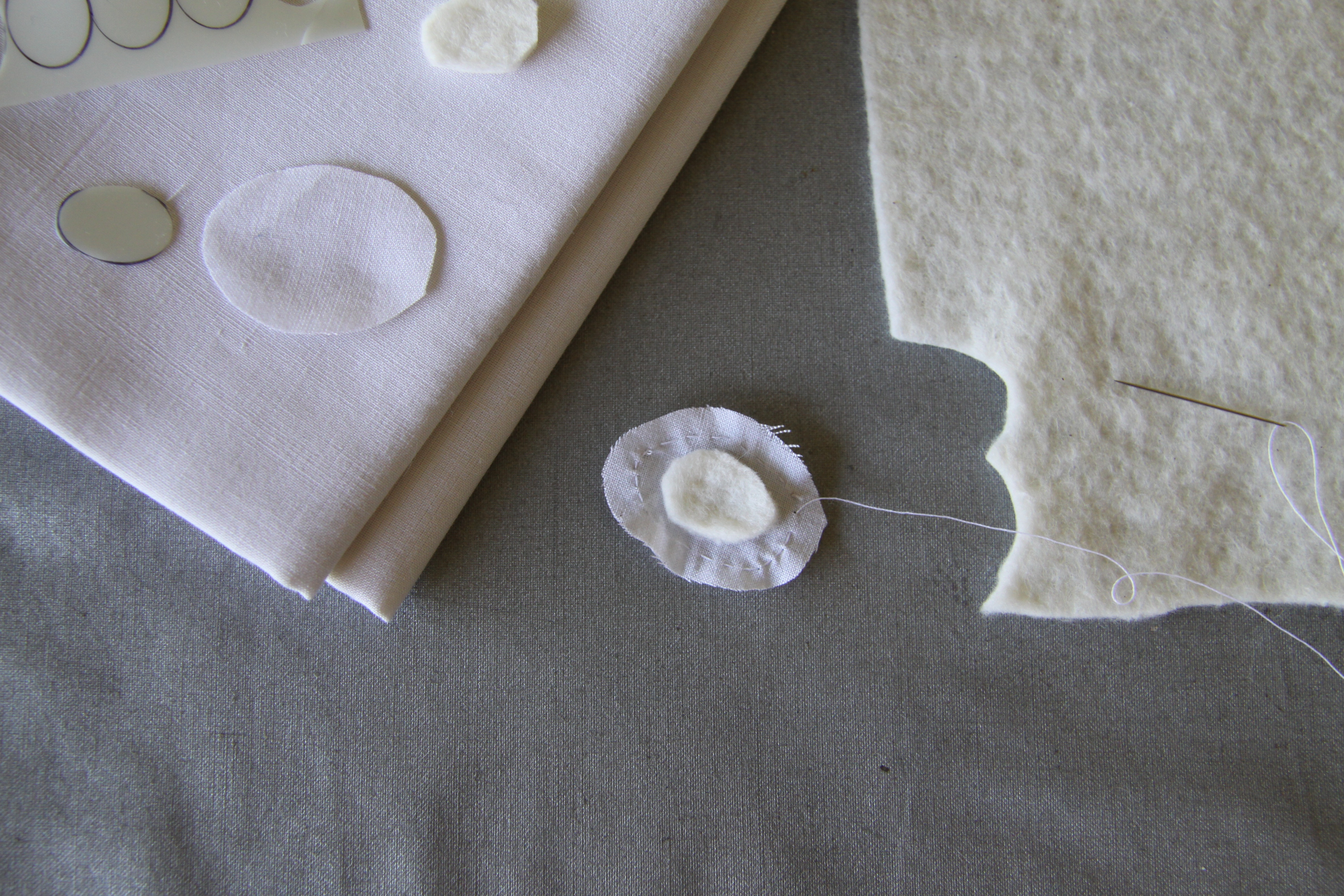
Circles and ovals are even easier than this. You should find that if you use a big enough seam allowance, Kemball style, when gathering over a template, that you have such a copious amount of gathered fabric on the reverse that no amount of dark background will show through. If you want the extra oomph as illustrated by the white berry spray on the raspberry background in the quilt above, just insert a batting circle during the gathering process thus sealing it inside. This not only adds some texture and literal lift to the piece, but will prevent shadowing at the same time. Pictures below are pretty self explanatory.

o

Pop template out in the usual way, retaining the batting within.
I do promise my blogs won’t all be re-runs but it seemed worthwhile getting this down on this new blog, (even if only for Ann to refer to whilst making her heirloom masterpiece and to remind her of what we discussed today!)

So glad to see you are back. Your lessons and pictures were missed.
I love the idea of the batting. The raised look is awesome.
Looks like I showed up just in time. You were the first thing I thought of this morning. I have your book Beautiful Botanicals and am ready to start something beautiful.
What a lovely comment! Thank you! Let me know if I can help.