Red Hot Chilli Peppers

August 29th 2013

Image


About twenty  years ago my brother took me out to dinner at an Indian restaurant in London.  I don’t remember the food but I do remember the large picture on the wall that blew me away with both its simplicity and pizzazz.  It was during a period when, along with a few other million Brits, I was experimenting with decorative effects in the house – marbling, stippling and such like.    You remember, I’m sure you do – we all went paint effect mad.   I had been playing around a lot with gilding, or my version of it, to quite a successful end.  I was actually selling frames, pots and other bits and pieces at various galleries in London.  To keep costs down I had been using a version of gold leaf called Dutch Gold which was sold in 6″ squares, as opposed to 4″ squares and was  fraction of the price of real gold leaf.  The picture that caught my eye was about 30″ square and was composed of a mass of gold leaf squares, all gilded with that lovely cracked, burnished finish and in the very centre of the picture, three perfectly painted chilli peppers.  the overall effect was brilliant – the bright, small realistic chillies, painted in oil, against the large gold background, all geometrically delineated by the gold leaf squares.  I have always meant to have a bash at creating a copy myself but as I still haven’t done it, twenty years on, the chances seem pretty remote.


Earlier on in the summer, whilst fiddling around with new ideas, the three chilli peppers came to fruition in a fabric version.

Image


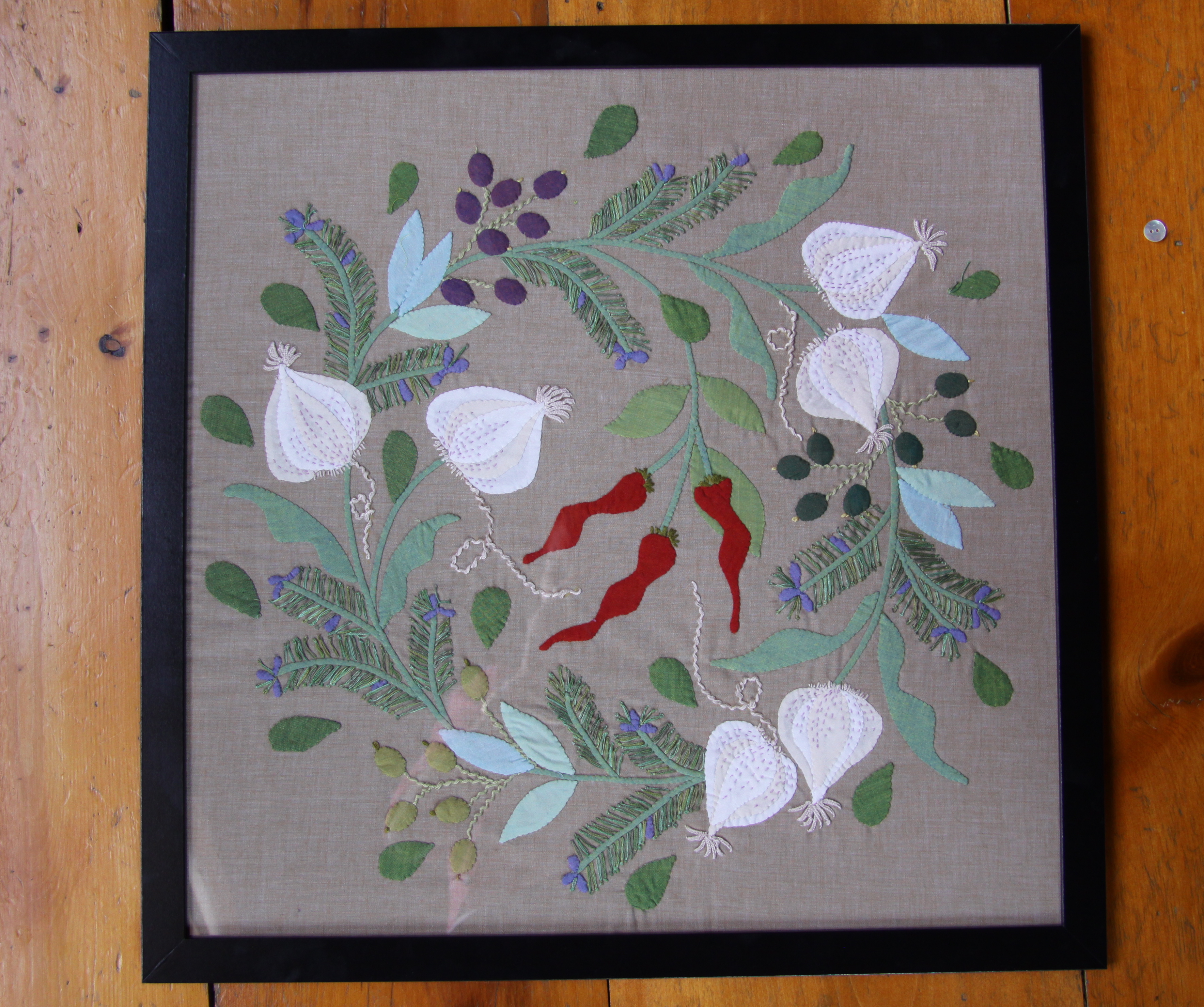
I’m not mad about the result of this piece and have left it unquilted but much has come from this first design.  I found the red chillies looked rather lost in the wreath and felt that they needed to be more balanced throughout the whole wreath.  You can see I was also experimenting with garlic.  I think I scored high for realism and they were fun to make but they are not easy to place, given their rather static quality.  I gave the bulbs stalks (!) for a bit of life but even then they still looked very plonked in place.   However, I was thrilled with the olives and rosemary.  In fact I was so thrilled with the rosemary that it has gone on to be in virtually everything I have sewn since.   Although I was disappointed with this first attempt at a “Kitchen Wreath” I decided to have a second bash this week.

I really love this new Red Hot Chilli Pepper Wreath which measures 18″ square.  I started it last weekend to give me a small project to work on in front of the US Open (we are tennis mad in my family) but I seem to have rather overshot timing-wise as we are not even into the second round yet…..


I used a combination of scrap silks and Oakshott cottons on a gorgeous orange Burmese silk background that I had in my stash.  Although the red peppers are pretty discreet against the orange I rather like this.  For simplicity’s sake I decided to only use embroidered stems and  I appliqued it in a rather different way, layering as follows.

I started with Bay Leaves (huge artistic license taken here but the colour is legitimate if nothing else)

Image


Add some olive leaves

ImageThrow in some olives……

ImageChillies….

ImageAnd finally some sprigs of rosemary….

Image

Now back to the tennis……


Standard

Labour of Love

August 22nd 2013


Labour of Love

Some years ago I was as obsessive about patchwork piecing as I am about applique now.   In 2002 I was particularly smitten with paper piecing tiny strips of fabric together, log cabin style and I spent several weeks making a whole pile of cushions in two similar designs, a paper pieced fan shape and a traditional twisted log cabin design.    I have always loved the look of a mass of pattern and colour heaped together and so I made a total of eleven cushions, each measuring 24 inches square.. 

Image


Piecing each individual top, tying it or quilting it and then making it into the finished cushion took one week of several hours of sewing a day which makes me think that I must have been mad at the time.   Such was my haste to get them on the sofa that unbelievably (with four messy sons at home) I stitched home made pillows inside, each without any opening at all for removal and washing and then bound the whole lot together with a double binding (and not very well either).  The pillows were also a home made hastily put together mass of lumpy bumpy what-ever-I-had-around mess of batting, old polyester filling, home made strips of fabric cut up etc etc.  Mmmm.  doesn’t sound good really  but they did look gorgeous and I’m pleased that I had three months of such lunacy as they have given me no end of pleasure for years, all those wonderful colours and patterns heaped up on two white sofas for over ten years now.  They have survived more than a decade being piled onto sofas, thrown off sofas, used as weapons, thrown onto the floor to lie on through three different boy teenage epochs, a puppy and now adult dog sleeping on them.   They have moved from Venezuela, to Canada, to Chile and back to Canada.  I love them.  Even more amazing was that before I renovated the lot last month they still weren’t looking too bad, or smelling for that matter.  A miracle given that they have never been washed.  In ten years.  Yuck.  It was time to bite the bullet and unpick all those bindings and remake them all.  

Image

Each pillow has had a painstakingly tedious renovation, I bought new backing for each, put a zip in every back, took every cushion apart, removed the bindings, mended any little holes (some had been made of silk), stitched together seams that had fallen apart, re-knotted with new embroidery thread where appropriate and bought new feather pillows to put inside.  I bound them all with new binding.

Image

Image

 I learned a lot throughout the process – I discovered  that I knew nothing about how to sew on binding 10 years ago,  that it is amazing how much upholstery comes to life when washed after ten years, that cream and black toile always look lovely to my eye and that Ikea sell beautiful feather pillows for literally one third of the price of all the other retailers I could find here in Montreal.  (Ikea = great feather pillows)

It really was worth the work.  They look like new and are ready for the next decade.

How about this for a gorgeous gift to fall through the letter box?   Such beautiful new Oakshott shot cottons, such astonishingly beautiful colours, so perfectly folded together.

Image

 For the moment I just gaze at them lovingly and wonder how long I can go before I have to open them.  These are two new collections, Lakes and Italy and some new Ruby Reds.  (www.oakshottfabrics.com)  Thank you Michael!!

Standard

Floral Impressions


Here is my new quilt, “Floral Impressions”, designed for a Block of the Month series with Michael Oakshott’s gorgeous fabrics.  Just finished, fingers still calloused from rapid hand quilting throughout Wimbledon, it had its unveiling at Quilt Festival, UK, last week.  There has been lots of interest so I thought perhaps it was time for its unveiling here too.  

Earlier this year Michael launched his new Impressions range. (http://www.oakshottfabrics.com/) and he kindly sent me some samples.  I love the bright clarity of the 16 pastels in the impressions range.  Each colour is shot through with white giving them a freshness that was especially appealing when they dropped through my letter box after the dark backgrounds I was working on in the middle of summer.   I bit the bullet and asked Michael if he liked the idea of a Block Of the Month quilt to start this fall.  He was as enthusiastic as I was by the idea so I set about designing a traditionally set quilt (individual blocks plus border) and Floral Impressions is the result.  It measures 52 ” x 52″

Image


I loved designing this quilt.  It took me out of my comfort zone, working with these new pastel shades on a white background, a change from my usual dark jewel toned palette.  I wanted to see if it would be possible to create a quilt using only one fat quarter pack of Impressions (plus background) and this limitation forced me to be more creative with my use of colour.  Had I confined my leaves to two greens I would have run out of fabric pretty quickly so I found myself alternating stem colours in the blocks, using both green and beige stems and several colours for the leaves too.  The black dictated the central olive wreath.  I had been playing around with incorporating more fruits and veggies in my designs over the summer and had recently been happy with the addition of olives, garlic and chilli peppers to my usual floral repertoire.   So of course black olives were a given.  I found the black worked well for the leaves too, probably the greatest surprise of the quilt.  All in all I think this equal use, or almost equal use of the sixteen colours that make up the Impressions range give this quilt a real charm – no single colour dominates.

As a block of the month quilt I had already decided that I would make the quilt up of 12 inch blocks and border and I knew that I would use wreaths and hearts for the central blocks.  Apart from that I had no real idea of the final design.  This made it both exciting and vaguely terrifying to make.  Exciting because I could just go with whatever I felt like on the day.  Terrifying because at the end I seemed to have nine blocks totally unconnected to each other.  Some blocks used large flowers, some flowers were obviously designs from real flowers, some were complete fantasy.  And there was the problem of the completely unrelated olive block too (one of my favourites so it had to stay).  I love this kind of mess my unorthodox design methods get me into because I love the challenge of then having to make the quilt make sense when it seems doomed to fail.  By using all of the flowers in the sweeping borders and confining the olives to olive trees in the corners suddenly the whole quilt came to life.  It was obvious that my favourite olive wreath should go slap bang in the centre and the hearts and wreaths all fell into place.  I feel it has resulted in a quilt that has great charm and vivacity and I’m very happy with it.  By alternating the background white with the colours for the prairie point edging the multicoloured scrappiness of the quilt is sustained right to the edges.

I hand quilted it in record time, like a mad whirling dervish, stitching along, rapid fire to the incredibly exciting Wimbledon tennis tournament.  I had a deadline, not just to get it to Michael in time for Quilt Festival, but to complete before my husband and I went on our dream of a lifetime holiday to celebrate our 30th wedding anniversary, a 300 km cycle ride around The Cabot Trail in Cape Breton, Nova Scotia all by ourselves (no kids invited!).  I met the deadline and our holiday was everything we wanted it to be and a whole load more.


Standard

Quick review on how to avoid shadowing of dark backgrounds through light coloured applique

I went to see a friend this morning who wanted advice on how to applique light coloured pieces on a dark background for a very special quilt she is making (50th wedding anniversary – how about that?!) and it seemed a good idea to include my techniques here too whilst I was on the topic.   This is a bit of a re-cap for some of you, but as my previous posts were all lost, which I know many of you used over and over again for info on techniques (you kindly wrote to tell me so), I thought it worth a bit of a re-run.

Few things pop more than white flowers on a dark background.  I love using rich dark backgrounds and knowing that white is the surest way to add some sparkle to a piece I always try to balance some white flowers throughout the quilt.  This is the applique I am working on at the moment.  It all looks a bit of a mess at this point but the white daisy and three petalled flower all have fabric stitched beneath them to give a bright white appearance and avoid the dark purple background showing through.

Image

This photo below is from my finished quilt Euphoria to illustrate just how much I love light flowers on a dark background.  Don’t the white flowers just pop….

Image

In both cases the white applique pieces have been interfaced to prevent the dark background showing through.   To illustrate just how bad it can look I sewed a sample petal this morning without any interfacing so you can see the problem – the turned under allowance is clearly visible as is the dark shadow of background showing through.  Trust me, it looks even worse in real life than the photo illustrates….

Image

For those of you that know my work, my applique broadly divides into two techniques  – fabric gathered up around a template (circles, ovals) and non round pieces such as petals and leaves which I sew directly on to the background.  For petals and leaves here are three ways to interface your applique relatively painlessly.  My favoured method is to sew another white fabric underneath.  This isn’t as onerous as it sounds and gives perfect results.  Use your freezer paper to cut your applique pieces in the usual way, leaving your generous seam allowance.  When you have cut all your pieces for applique peel off the freezer paper to use again as a guide to cut your interfacing fabric.  Iron it on as usual but this time cut the motif slightly smaller than the paper template (ie you’ll be cutting the paper edge too).   Remove the freezer paper and stitch this in place with a small neat basting stitch through the centre of the motif as shown.  As you’ll see I have used a printed white on white fabric – one I know I will never use and hence its use here – ( I know the print will not show through and I don’t want to use my lovely Oakshotts for anything unseen!).  By using the freezer paper template in this way you will get exactly the right size for the interfacing.  Stitch in place.

Image

It’s important to only stitch down the centre because when you come to applique your piece on top you will find that you will automatically turn the seam allowance under the edges of this base piece.   Your final white flower will look perfect, no seam allowance showing, no “shadowing”.   You can spice things up even more by using a batting instead of fabric to interface the piece and this will give you gorgeous raised white motifs as perfectly illustrated by these berries.   

Image

I made a mock up of your three best options this morning – white fabric stitched through the centre, batting stitched through the centre and, for those of you who feel life is just too short for this sort of nonsense, a fusible interfacing ironed in place.  This latter option will inevitably give a firmer result which may not matter to you and is definitely a better option than nothing at all, so I’ve included it as well.  I never use glue in my work but I’m sure this would be a good time for those of you who do use it, to put it into action.

Image

Circles and ovals are even easier than this.   You should find that if you use a big enough seam allowance, Kemball style,  when gathering over a template, that you have such a copious amount of gathered fabric on the reverse that no amount of dark background will show through.  If you want the extra oomph as illustrated by the white berry spray on the raspberry background in the quilt above, just insert a batting circle during the gathering process thus sealing it inside.   This not only adds some texture and literal lift to the piece, but will prevent shadowing at the same time.  Pictures below are pretty self explanatory.

Image


Image

oImageImage

Pop template out in the usual way, retaining the batting within.

I do promise my blogs won’t all be re-runs but it seemed worthwhile getting this down on this new blog, (even if only for Ann to refer to whilst making her heirloom masterpiece and to remind her of what we discussed today!)  


Standard

August 6th, Montreal, Canada

It’s been such a long while since I last wrote a blog and so much has happened since my last proper entry more than a year ago.  We have moved from one end of the world to another, settled back into life in Canada, acquired a new member of the family (Milo, the dog) and I took what I thought would be a permanent break from applique and quilting.   However, in spite of all my threats to family and friends, vowing never to pick up a needle and thread again, within a few months I had new ideas emerging unsolicited and before I knew where I was I was rummaging through my packed up fabrics, chastising myself for giving away needed silks and colours, trying to sort packed up sewing bits and pieces.  These had all been thrown hastily into boxes in a huff in Chile such was the bitterness of the ending of my love affair with all things textile.    No-one was more surprised than me to find myself happily back in my studio and sewing again.  The family didn’t even both to resist their smug expressions and “I told you so’s” muttered sotto voce as they wandered through my fabric strewn studio.

It turned out that the idea of having completed all the designs I wanted to complete was truly liberating.   I found myself dreaming up new ideas, new techniques, new embroidery, new designs.  In fact I rather think that there is a whole new Beautiful Botanicals ready to be written.

I have been sewing steadily for the past few months now, and although perhaps not quite as manically as before (puppies see to that) I have never been so happy in my work and have really enjoyed being back among all my fabrics.  I suspect my love affair with silks is over and I don’t see myself buying more, although always thrifty by nature, I will use those that remain.  Don’t get me wrong, I love silk quilts.  I love my silk quilts.  The final results gleam and glow but they are vulnerable with time, they are impossible to wash, and silk does have a tendency to fade over time. 

Here is a photo of the first project I completed earlier this year when I was having some fun with experimenting with new ideas.  It uses a mixture of silk remnants and Oakshott cottons, a whole new quilting technique, new embroidery techniques and an easy quick version of reverse applique.  Gus calls it my “Greek Flag Pillow”.  There are two in this series and they make a refreshing change from my floral pillows.


Image

Meanwhile back to my more traditional look, Michael Oakshott and I are launching a Block of the Month in October.  I am confident that those who like my work will love this quilt, a mixture of my designs and traditional block by block make up.  What is more the designs and a whole year’s worth of e mail support from me will be totally free to those that buy the fat quarter pack of his new Impressions range.  Watch this space for details!


Standard